


Overview
One of India’s most widely used exam platforms was due for a rethink. The interface had not aged well — with usability gaps, navigational inconsistencies, and limited scalability across question types. I led the end-to-end redesign to bring clarity, calm, and modern experience design to the center of this national-level exam system.
My Role
Sole Product Designer
Timeline
14 Days
Year
2025
Team
Behavioral Scientist (Lead Researcher), Project Manager, Business Stakeholders
The Brief
We got a demo of the existing candidate exam interface and we were asked to redesign it to give it a new “look and feel”
Challenge
The Interface looked Outdated and it was Confusing

We evaluated the interface amongst ourselves, asked a bunch of questions to the business on how it worked and evaluated the user experience based on learnability, efficiency and usability.
Process
Shadowing and 1-1 User Interviews

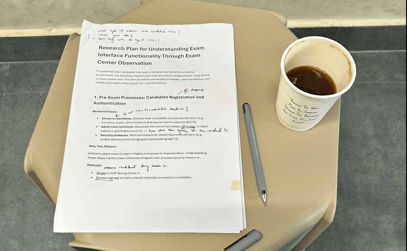
We decided to visit 1 test centre to speak to candidates face to face and discover core problems with the examination interface. In addition, I was allowed to shadow one of the invigilators and observe how candidates used the interface.
Reason? They couldn't read the entire passage. They had to scroll within a limited area or had to use 'Zoom in' button. Interesting fact - 3/8 candidates were not aware of this button :)
3 out of 8 candidates who attended the exams for the first time were not aware of mock exams being sent to them
Because of this unfamiliarity, they felt anxious about the exam and it affected their performance.
They used it to bookmark questions and later jumped between them. We also learned that they bookmarked questions that were both answered and not answered
2 Candidates finished the exam sooner and wished they could leave earlier.
Currently, there was no way to put a stop to the exam and leave earlier.
How might we redesign a neat interface and make it feel like there is nothing standing in between the candidate and the questions they have to answer ?
Solution
A Better Onboarding
We designed a lounge before the examination starts for candidates to be able familiarize the exam interface.
Simplified Interface
We took away everything that candidates did not require and kept important information within reach.
Scalable to all Types of Questions
Comprehension questions were given more real estate so they can do less scrolling in addition to having a way to expand them.
Impact
We Tested the Redesign with 4 Candidates
We made an end-end Figma prototype mocking a real exam and asked candidates to use them. I closely observed and listened to them for further insights.


What I learned
What Field Research and Fast Iteration Taught Me
Design for Calm, Not Just Functioning Process & Delivery
Designing for high-pressure environments like national-level examinations requires balancing usability with calmness and clarity.